
UI and UX in the industrial context
Industrial control systems, such as SCADA and DCS, have long been the backbone of critical infrastructure operations; yet, their user interfaces often lag behind the polished, intuitive designs familiar from consumer applications. As we continue to advance in automation and digital transformation, it becomes increasingly clear that applying core UI (user interface) and UX (user experience) principles, along with embracing standardization, can transform these systems from cumbersome tools into empowering assets for operators. Drawing on insights from recent projects, we’ll discuss how thoughtful design and consistent standards elevate control system usability, safety, and efficiency.
When we talk about UI, we refer to the visual elements that operators interact with, such as colors, fonts, button shapes, layouts, and graphics. UI is what you see when you glance at a screen. In industrial settings, this often means minimalist, grayscale palettes punctuated by color only for alarms or critical states. This restrained approach is a deliberate choice to minimize distractions and enable operators to identify issues quickly.
Defining UX is more elusive. It refers more to the feeling and flow of using the system over time. How intuitive is it to navigate from an overview screen to a detailed process? How many clicks does it take to execute a critical command? Does the interface reduce cognitive load or add to it? These questions can’t be answered by screenshots alone; they require observing operators in real situations and adapting designs based on their feedback.
High-performance graphics
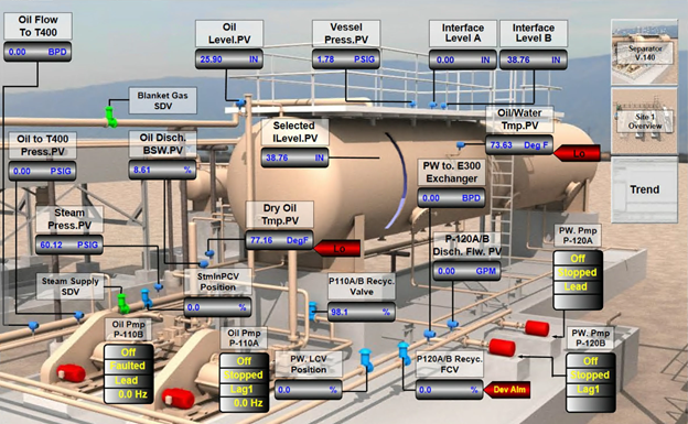
High-performance graphics have become something of a buzzword in industrial automation. Shouldn’t all graphics be “high-performing?” At their core, they represent a design philosophy focused on clarity and efficiency. Instead of cluttering screens with every possible data point, these graphics prioritize useful information and present it in a way that supports quick comprehension.
Raw numbers without context are often meaningless. Seeing a tank level at “12 feet” means little unless you also understand whether that’s near empty, full, or a critical alarm threshold. High-performance graphics integrate trends and graphical depictions directly onto process screens, allowing operators to grasp the system’s current state and recent behavior at a glance.
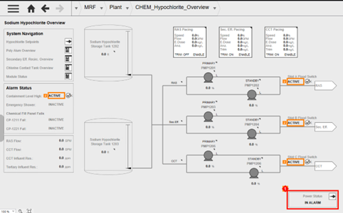
Use of color is another shorthand strategy. Grayscale dominates, but alarms flash in red or yellow, which immediately draw the eye. This approach is also more accessible for colorblind operators. Since most screen elements remain neutral, the few colored alerts stand out.
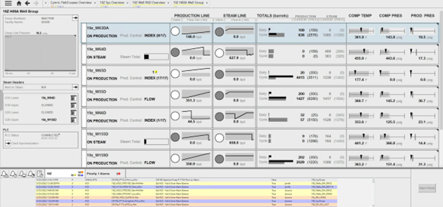
Layout and hierarchy also serve as visual aids. Screens are organized so overview pages show key performance indicators, while drilling down reveals more detailed information relevant to specific processes or equipment. High performance graphics avoid pop=up windows because they can obscure important data. Instead, side panes or faceplates provide additional details without disrupting the main view.
Key UI elements
Buttons are everywhere in SCADA systems, from navigation to critical controls like starting or stopping pumps.
While dragging a button onto a screen might seem straightforward, good button design is anything but trivial. Labels must be clear and concise, often in all caps, to stand out from descriptive text. The clickable area should be well-defined. Operators need immediate visual feedback to know a button press was registered, and disabled buttons should be unmistakably distinct. Sometimes, critical actions require confirmation dialogs to prevent costly mistakes.
Text fields serve dual roles: users enter data like set points, and operators read values from sensors or statuses. These fields must be clearly labeled, with error messages guiding correct input. Left alignment is crucial for data entry to ensure clarity, especially when units of measurement are involved. Read-only fields should look different from editable ones, often grayed out or marked explicitly, so users don’t waste time trying to interact with something static.
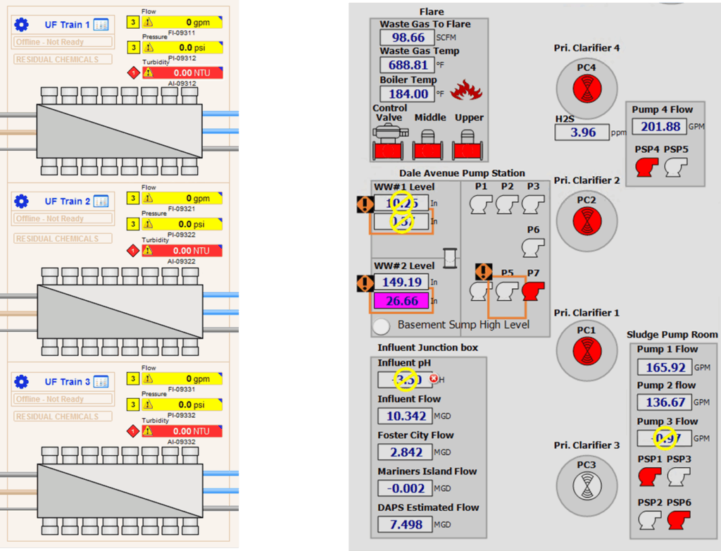
Boxes and containers organize related information, grouping controls and data to help users scan the screen quickly. However, they shouldn’t be a crutch for poor layout. Instead, consistent grid systems enable users to predict where information will appear and navigate screens effortlessly. Sometimes white space is even more effective than visible boxes, provided the grid structure is clear.

Standardization
Standards define what information should be displayed, how it should behave, and ensure that the underlying system supports those standards robustly. This predictability in design helps reduce training time and minimizes errors, especially in high-stress or emergency situations. When operators see the same kind of analog input or alarm display across multiple screens, they develop an intuitive understanding of what to expect and how to interact.
Recently, the industry has gravitated towards high-performance standards that emphasize monochromatic designs with selective color use for alerts. These standards improve operator response times and reduce cognitive load by simplifying the interface.
No standard is perfect from the start. Standards must evolve based on operational feedback, new technologies, and changing client needs. For us, standardization isn’t just applied to SCADA screens, but also the PLC programming and every other part of the system.
Logging issues, change requests, and operator comments creates a living document that guides future improvements.
Testing standards thoroughly before widespread deployment is key. Introducing untested graphics or configurations across multiple projects risks repeated errors and costly rework. A disciplined approach—testing one element at a time, conducting FATs with client participation, and documenting results—pays dividends in long-term stability.
Engage your operators!
Getting operators involved early and often through workshops, design reviews, and Factory Acceptance Tests (FATs) is critical. Operators bring invaluable insights into how the system is used day-to-day, what information is truly useful, and what can be hidden or simplified. Their feedback helps tailor standards to the real world rather than an idealized version.
Operators might be accustomed to older, more colorful, or “realistic” graphics that mimic physical equipment. But when the benefits, such as faster training, fewer mistakes, and better situational awareness, are clearly communicated, this makes the transition easier.
When operators don’t participate or feedback is lacking, problems arise later during commissioning or even after deployment. It’s essential to involve the shift leads, area supervisors, and daily users to ensure the design meets their needs. We use methods like sending videos to remote clients or recording sessions for review to keep everyone updated on what’s next.
Balance technical constraints and user needs
Admittedly, every SCADA environment has technical limitations. Some software platforms make it easier to implement high-performance graphics and standardized elements, while others require more manual coding and workarounds. Understanding these constraints early helps set realistic expectations and timelines.
Moreover, physical factors like screen size, input methods (mouse, touchscreen, glove use), and ambient conditions (bright sunlight) impact design decisions. Buttons that look perfect on a large monitor may be unusable on a small touchscreen if the clickable area is too tiny. Testing designs under real-world conditions is non-negotiable.
Our case for UI/UX improvement
The end result of UI/UX improvements and standardization should be an environment that allows operators to make better decisions faster, reduce downtime and accidents, and improve overall system reliability. Tactics like high-performance graphics account for the complexity of industrial operations and offer greater clarity and usability. Ultimately, design is a lot more than just making the screen “look pretty.”
Training becomes simpler when consistent standards are in place, and operators gain confidence knowing that what they learn on one screen applies across the board. Both budget and performance benefit from safer systems that are easier to maintain and upgrade. By focusing on operator needs and engaging them throughout the project lifecycle, these critical systems can become intuitive tools that empower those who rely on them every day.